














 En
En
 16 min read
Introduction: Turning Social Media Traffic Into Real Customers
Social media has changed the way brands connect with potential customers. Platforms like Instagram, Facebook, TikTok, Pinterest, and YouTube are no longer just places for entertainment and communication. They have become powerful shopping channels where consumers discover products, compare options, and make purchasing decisions.
However, getting someone to click your social media post is only the beginning.
Many online businesses invest significant time and money creating attractive ads, publishing engaging content, and building a strong social presence. They celebrate high click numbers but later discover that visitors leave without buying anything. The problem is often not the advertisement itself. The real issue is what happens after the click.
A social media visitor arrives with a specific expectation. They clicked because something caught their attention: a product image, a discount offer, a creator recommendation, or a solution to a problem. If your landing page does not immediately continue that experience, visitors may lose interest and leave.
A well-designed landing page acts as a bridge between social media attention and online sales. It guides visitors from curiosity to confidence, removes doubts, and encourages them to complete their purchase.
This article explains how to optimize a social media landing page, improve the customer journey, and create a smoother path from a social media click to a completed order.
1. Understand the Difference Between Social Media Visitors and Regular Website Visitors
Before improving your landing page, it is important to understand where your visitors come from.
Someone who arrives through a search engine usually has a clear intention. They may already know what they want and are actively looking for a solution.
Social media visitors behave differently.
They are often in the discovery stage. They may not have planned to buy anything when they opened Instagram or TikTok. They clicked because your content created interest in a few seconds.
This means your landing page needs to do more than simply display products. It must quickly answer several questions:
- What is this product?
- Why should I care?
- How can it solve my problem?
- Why should I trust this brand?
- Why should I buy now?
A successful landing page understands the mindset of social media users. It continues the conversation that started with your post or advertisement.
For example, imagine someone sees an Instagram video showing a compact outdoor storage box that protects furniture from rain and dust.
The user clicks because the video solves a problem they recognize.
If the landing page immediately shows:
- the same product image,
- the same benefit message,
- clear product advantages,
- customer reviews,
- easy purchase options,
the visitor feels they arrived at the right place.
But if they land on a generic homepage with dozens of unrelated products, they may become confused and leave.
The first rule of social media landing page optimization is simple:
The landing page must match the visitor’s expectation from the original social media content.
2. Create Message Consistency Between Social Media and Landing Pages
One of the biggest mistakes brands make is creating a disconnect between advertisements and landing pages.
A customer clicks on a post promising “50% off summer outdoor protection solutions,” but the landing page only shows a normal product catalog. The visitor immediately wonders:
“Did I click the wrong link?”
This small moment of confusion can significantly reduce purchase motivation.
A strong landing page should maintain consistency in:
Visual Style
The colors, images, product photos, and overall design should feel connected to the social media content.
If your Instagram advertisement uses bright lifestyle images, the landing page should not suddenly look like a completely different website.
Headlines
The main headline should repeat or expand the key message from the social media post.
For example:
Social media message:
“Protect Your Patio Furniture From Harsh Weather”
Landing page headline:
“Premium Outdoor Furniture Covers Designed for Rain, Sun, and Dust Protection”
The visitor immediately understands they are in the right place.
Product Benefits
Social media usually focuses on one attractive benefit. The landing page should continue explaining that benefit.
A short video might highlight:
“Fits small balconies perfectly.”
The landing page can expand:
“Designed for apartments, balconies, and compact outdoor spaces, this cover provides reliable protection without taking up unnecessary storage room.”
Consistency creates confidence.
3. Design the First Screen to Capture Attention Immediately
The first screen visitors see before scrolling is one of the most important parts of your landing page.
Most social media users browse quickly. They decide whether to stay within seconds.
Your first screen should clearly communicate:
- What you sell
- Who it is for
- Why it matters
- What action visitors should take
A strong first section usually includes:
A Clear Main Headline
Avoid vague statements.
Weak example:
“Welcome to Our Online Store”
This tells visitors nothing.
Better example:
“Keep Your Outdoor Furniture Looking New Through Every Season”
The second headline immediately communicates value.
A Supporting Description
Explain the main benefit in one or two sentences.
Example:
“Designed with durable weather-resistant materials, our furniture covers help protect your outdoor space from rain, sunlight, dust, and everyday wear.”
A Strong Call-to-Action Button
The button should clearly tell visitors what happens next.
Good examples:
- Shop Now
- Get Your Discount
- Explore Collection
- Choose Your Size
- Buy Today
Avoid unclear buttons like:
- Click Here
- Learn More
- Continue
Visitors should never wonder what action they are taking.
4. Optimize Landing Page Speed for Mobile Users
Most social media traffic comes from mobile devices.
A visitor clicking from TikTok or Instagram is likely using a smartphone. If your landing page loads slowly, you may lose potential customers before they even see your product.
Mobile users expect fast experiences.
Important improvements include:
Compress Images
High-quality images are important, but extremely large files can slow down your page.
Use optimized images that maintain visual quality while reducing loading time.
Reduce Unnecessary Elements
Too many animations, pop-ups, and complicated design features can make the page slower and distract visitors.
A clean layout often performs better.
Make Buttons Easy to Tap
Mobile visitors should not struggle to click purchase buttons.
Buttons should be:
- large enough,
- clearly visible,
- placed naturally throughout the page.
A smooth mobile experience removes unnecessary barriers between interest and purchase.
5. Use Product-Focused Landing Pages Instead of General Pages
When social media users click a promotional link, sending them to your homepage is often a missed opportunity.
Your homepage introduces your entire brand, but a landing page has one specific goal.
That goal is usually:
- selling one product,
- promoting one collection,
- collecting customer information,
- encouraging a specific action.
A focused landing page eliminates distractions.
For example, if your social media campaign promotes blue-light blocking glasses, the landing page should focus on:
- benefits of blue-light protection,
- frame styles,
- customer reviews,
- pricing options,
- buying guide,
- purchase button.
It should not force visitors to browse unrelated categories like sunglasses, accessories, or other products.
The fewer unnecessary choices visitors have, the easier it becomes for them to complete a purchase.
6. Build Trust Immediately With Social Proof
One of the biggest challenges of selling through social media traffic is trust.
Unlike customers who already know your brand, social media visitors are often discovering you for the first time. They may have never heard of your company before clicking your link.
Before purchasing, they usually have questions:
- Is this product really as good as advertised?
- Will it look like the pictures?
- Can I trust this store?
- Will my order arrive safely?
- What happens if there is a problem?
A landing page should answer these concerns before customers leave.
One of the most effective ways to build confidence is through social proof.
Social proof shows visitors that other people have already purchased and enjoyed your products.
Useful trust-building elements include:
Customer Reviews
Real customer experiences are powerful because they reduce uncertainty.
A strong review section should include:
- customer names or initials,
- product photos from real buyers,
- specific experiences,
- details about product performance.
Compare these two examples:
Weak review:
“Great product! Love it!”
Strong review:
“I purchased this outdoor furniture cover six months ago, and it has protected my patio chairs through heavy rain and intense summer sunlight. The material still looks new, and the size fits perfectly.”
The second review feels more authentic because it provides specific information.
User-Generated Content
Photos and videos from customers can be more convincing than professional advertising images.
Many shoppers want to see how products look in real homes and everyday situations.
For example:
- clothing customers showing different body types,
- furniture customers sharing their home setups,
- outdoor product customers showing seasonal use.
Real-world examples help potential buyers imagine owning the product.
Ratings and Purchase Numbers
Displaying information such as:
- thousands of satisfied customers,
- average customer ratings,
- popular product labels,
can increase confidence.
However, all information should be genuine. Modern consumers are increasingly sensitive to exaggerated claims.
7. Highlight Benefits Instead of Only Listing Features
Many brands make the mistake of describing products only through technical features.
Customers usually do not buy features. They buy solutions.
A landing page should translate product details into real-life benefits.
For example:
Feature:
“Made with 600D waterproof Oxford fabric.”
Benefit:
“Protect your outdoor furniture from unexpected rain and moisture with a durable waterproof material designed for daily outdoor use.”
The feature explains what the product has.
The benefit explains why customers should care.
A good landing page answers:
“How will this product improve my life?”
Examples:
Instead of:
“Adjustable straps included.”
Use:
“Secure your cover even during windy weather with adjustable straps that keep it firmly in place.”
Instead of:
“Multiple sizes available.”
Use:
“Choose the perfect fit for balconies, patios, gardens, and different furniture shapes.”
Customers connect emotionally with outcomes, not specifications.
8. Use Visual Storytelling to Increase Purchase Desire
Social media is highly visual, so your landing page should continue that visual experience.
Strong product pages do not simply display images. They tell a story.
A powerful visual structure may include:
Lifestyle Images
Show the product being used in a real environment.
For example:
Instead of only showing a furniture cover on a white background, show:
- a beautiful backyard,
- protected patio furniture,
- different weather conditions,
- a clean outdoor living space.
Customers are not only buying the product. They are buying the lifestyle associated with it.
Before-and-After Comparisons
Before-and-after images quickly communicate value.
Examples:
- old damaged furniture versus protected furniture,
- messy storage space versus organized space,
- tired appearance versus refreshed appearance.
Visual comparisons help customers understand transformation.
Product Detail Images
Close-up images answer practical questions:
- What does the material look like?
- How strong are the seams?
- How does the product fit?
- What details make it different?
The more questions your images answer, the fewer doubts customers have.
9. Make the Buying Process Simple and Clear
A complicated checkout process can destroy the results of excellent marketing.
After convincing visitors to buy, do not create unnecessary obstacles.
A smooth buying experience should include:
Clear Product Selection
Customers should easily choose:
- size,
- color,
- quantity,
- product options.
Avoid confusing layouts where visitors must search for basic information.
Transparent Pricing
Unexpected costs are one of the main reasons customers abandon purchases.
Clearly display:
- product price,
- shipping information,
- available discounts,
- return policies.
Transparency creates trust.
Simple Checkout Steps
Reduce unnecessary form fields.
Ask only for information needed to complete the order.
A customer who already decided to buy should not have to complete a long and frustrating process.
10. Add Urgency Without Creating Pressure
Social media users often browse casually. They may like your product but postpone purchasing.
A small amount of urgency can encourage action.
However, urgency should feel natural, not aggressive.
Effective examples include:
Limited-Time Offers
Example:
“Enjoy 15% off your first order this week.”
Seasonal Promotions
Example:
“Prepare your outdoor space before the rainy season begins.”
Limited Stock Notifications
Example:
“Popular sizes are selling quickly.”
The key is honesty.
Fake countdown timers and unrealistic claims may damage customer trust.
A good landing page encourages action while maintaining credibility.
11. Personalize Landing Pages Based on Social Media Campaigns
Different audiences have different motivations.
A visitor from a home improvement video may care about durability.
A visitor from a fashion influencer may care about style.
A visitor from a discount advertisement may care about price.
Using the same landing page for every audience may reduce effectiveness.
Instead, create pages based on visitor intent.
Examples:
Product Education Campaign
Focus on:
- explanations,
- benefits,
- comparisons,
- guides.
Discount Campaign
Focus on:
- offer details,
- savings,
- fast purchasing options.
Influencer Campaign
Focus on:
- creator recommendations,
- lifestyle images,
- personal experiences.
Matching the landing page with the visitor’s reason for clicking creates a more natural buying journey.
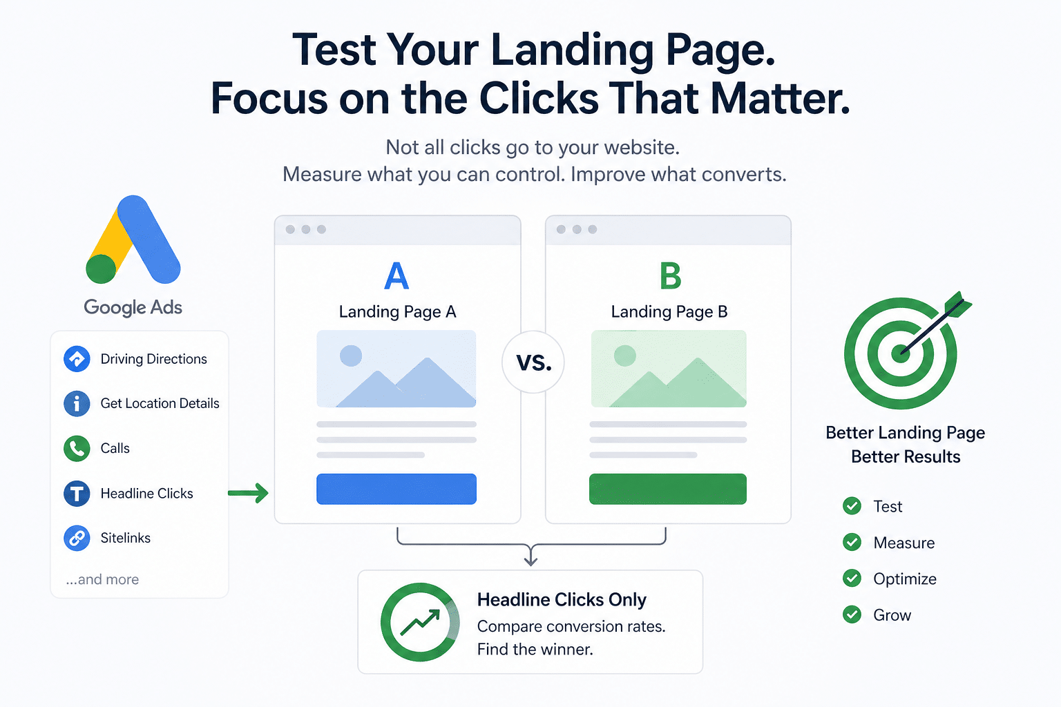
12. Improve Your Landing Page Through Continuous Testing
A successful landing page is rarely perfect from the beginning.
Small changes can create significant improvements.
Test different versions of:
Headlines
Compare different messages:
Version A:
“Premium Outdoor Protection for Your Furniture”
Version B:
“Keep Your Patio Furniture Beautiful All Year Long”
Different audiences may respond differently.
Images
Test:
- lifestyle images,
- product-only images,
- customer photos.
Button Text
Try different calls-to-action:
- Shop Now
- Get Yours Today
- Start Protecting Your Furniture
Page Layout
Experiment with:
- review placement,
- product information order,
- image positions.
The goal is not to make random changes. Every adjustment should be based on customer behavior and purchasing patterns.
13. Use Analytics to Understand Customer Behavior
Data helps you understand what visitors actually do on your landing page.
Important measurements include:
Visitor Numbers
Shows how many people arrive from social media campaigns.
Purchase Rate
Shows how many visitors complete orders.
Time Spent on Page
Helps determine whether visitors are engaging with your content.
Exit Points
Shows where customers leave.
For example:
If many visitors leave after viewing shipping information, there may be concerns about delivery costs.
If many visitors add products to the cart but do not complete checkout, the checkout process may need improvement.
Understanding visitor behavior allows you to make smarter improvements.
14. Common Landing Page Mistakes That Reduce Sales
Even attractive landing pages can fail because of small mistakes.
Mistake 1: Too Much Information Above the Purchase Button
Customers need enough information to make decisions, but overwhelming them can create hesitation.
Organize content clearly:
- main benefit first,
- supporting details second,
- technical information later.
Mistake 2: Weak Product Photos
Poor-quality images make products appear less valuable.
Invest in professional-looking visuals.
Mistake 3: Missing Mobile Optimization
A page that looks good on desktop but performs poorly on phones will lose social media customers.
Always check:
- loading speed,
- image display,
- button placement,
- checkout experience.
Mistake 4: No Clear Reason to Buy Now
If customers have no motivation to act, they may leave and never return.
Provide:
- strong benefits,
- customer proof,
- attractive offers,
- clear next steps.
15. The Future of Social Media Shopping: Experience Matters More Than Ever
Social commerce continues to grow because customers enjoy discovering products through engaging content.
However, successful brands understand that a click is not a sale.
The real opportunity begins after the click.
A high-performing landing page creates a complete experience:
- it continues the story from social media,
- builds trust,
- explains value,
- removes doubts,
- makes purchasing simple.
The brands that succeed online are not only those with attractive products. They are the brands that understand customer psychology and create smooth experiences from discovery to checkout.
Conclusion: Turn Every Social Media Click Into a Buying Opportunity
Social media can bring thousands of potential customers to your independent online store, but traffic alone does not guarantee sales.
The landing page is where interest becomes action.
By creating consistent messaging, improving mobile performance, showing real customer experiences, highlighting benefits, simplifying checkout, and continuously improving the customer journey, businesses can transform casual visitors into loyal buyers.
Every social media click represents a person who showed interest in your brand. A carefully optimized landing page gives that interest the best chance to become a completed purchase.
The goal is simple:
Do not just attract visitors.
Create an experience that makes them confident enough to buy.